Mercator's projection: the map that straightened the sea
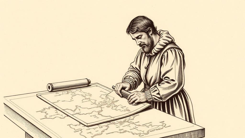
Somewhere in Duisburg, in the late summer of 1569, a Flemish cartographer named Gerardus Mercator was pressing ink into eighteen copper plates, each destined to tile together into a wall map nearly two metres long. When assembled, they would depict the entire known world — and embed a mathematical trick so useful that navigators are still relying on it today.
Mercator, born Geert De Kremer in 1512 in Rupelmonde, had chosen the Latinized name professionally. By 1569 he was 57, serving as court cosmographer to Duke Wilhelm of Cleves, and a deliberate exile from the Low Countries. In 1543, he had appeared on a list of 52 suspected Lutheran heretics drawn up by the Inquisition. He spent seven months in Rupelmonde castle waiting to learn his fate. No incriminating evidence emerged, and he was released — though two men on the same list were burned at the stake, one was beheaded, and two women were entombed alive. He moved his family to the more tolerant Duchy of Cleves in 1552 and does not appear to have looked back.
The map — formally titled Nova et Aucta Orbis Terrae Descriptio ad Usum Navigantium, “A new and more complete representation of the terrestrial globe properly adapted for use in navigation” — was dedicated to Duke Wilhelm and printed on eighteen copper-engraved sheets measuring 202 by 124 centimetres when assembled. The geography drew from Portuguese and Spanish portolan charts. The projection was something else entirely.
The problem it solved had plagued ocean navigators for nearly a century. On a globe, sailing a constant compass bearing traces a spiral called a rhumb line. On every flat map before 1569, that spiral appeared as a curve — which meant a navigator who drew a straight line between two ports and read off the bearing would drift off course almost immediately. Mercator stretched the map’s latitude lines progressively farther apart as they approached the poles, compensating for spherical distortion, so that any constant-bearing course appeared as a straight line on paper. Ruler, bearing, go.
The remarkable part is that he worked this out without the mathematics to prove it. Logarithms and calculus had not yet been invented; the proper analytical derivation wouldn’t arrive until the English mathematician Edward Wright published it in 1599 (EBSCO Research Starters). Mercator arrived at his spacing empirically, adjusting the parallels until rhumb lines looked straight. His map’s own legend acknowledged the limits: the projection “cannot be extended as far as the pole, for the degrees of latitude would finally attain infinity.”
The cost was distortion. Greenland swells to roughly the size of Africa — wrong by a factor of fourteen. Sixteenth-century cartographers had no shipping routes through polar waters and no particular reason to mind, but the argument about what that inflation does to our collective mental picture of the world has now outlasted several generations of rival projections, none of which have managed to displace Mercator’s method for navigation.
The map was not an overnight success. Sailors were slow to trust a theoretical solution they couldn’t verify at sea, and reliable longitude measurement waited another two centuries for Harrison’s chronometers. The Mercator became the standard nautical chart only in the 1700s, roughly 130 years after publication. Mercator himself died in 1594. Jodocus Hondius purchased his copper plates in 1604 and built an atlas empire on them.
The world, for three centuries at least, looked the way Mercator said it did — and when satellite imagery finally gave cartographers something truer to work with, navigation software defaulted to his projection anyway.
Sources
- Mercator 1569 world map — Wikipedia — Publication details, physical dimensions of the eighteen-sheet map, rhumb-line innovation, and the map’s own text on polar limits.
- Gerardus Mercator — Wikipedia — Biography: heresy imprisonment in 1543, exile to Duisburg, service under Duke Wilhelm, and Hondius’s 1604 purchase of the copper plates.
- Mercator Publishes His World Map — EBSCO Research Starters — The empirical method behind the projection, Edward Wright’s 1599 analytical proof, and the projection’s slow adoption in navigation.